Dear Examiner
Here is my AS level media coursework blog which I have done all of my work on. I have done a lot of research and planning to look at other magazines and see variations of magazines to get inspiration from which helped me throughout the process of making my magazine. I hope you have enjoyed looking at my blog from start to finish and seeing how I have created my work throghout and how my skills have developed throughout. I hope you enjoy looking at my magazine cover, contents and double page spread. All of my links and labels are at the bottom of the page.
Thank you
Samrita :) X
xx
Media Coursework
Friday 8 April 2011


Tuesday 15 March 2011
Evaluation Question 7
7. Looking back at your preliminary task (the continuity editing task), what do you feel you have learnt in the progression from it to full product?
Conclusion
The pleniminary magazine doesn't look very proffesional whereas the final magazine is more proffesional and the pictures are much more proffesional and classy compared to the pleminary. I have gained more skills from doing the magazine as before it was really hard to use photoshop and you can tell by the quality of my magazine that I couldn't really use it that well as I was just learning how to use it. I think my skills have developed really good as my final magazine is far better than the pleniminary as it looks far better and it also fits in with the R&B look and would fit in if it was in a magazine. I have learnt that to make a magazine look like a professional magazine you have to make sure that the pages all link together with the colours used, also there needs to be about 3 colours used because too little can look too minimalistic and too much can look too cramped and tacky. I have improved by making my pictures much more professional looking by making the hair and makeup match my genre of music, the preliminary magazine didn't have a specific look on the picture so you wouldn't be able to tell what sort of magazine it was from the pictures whereas on my final magazine you can see that it is an R&B/ Hip Hop magazine because she shows that she has attitude.My knowledge of photopshop has got much better throughout making my product, I have also learnt how to use iphoto which helped me make the pictures look much better by removing spots and making my model look much more flawless. I learnt how to not only cut out images but to also use the rubber tool which was really easy. I have also learnt that I can download fonts which make the article much more aestetically pleasing and make it stand out more and fit into the genre more. I have learnt that you can edit fonts on paint which is what I did to my title and make the arrow on the A and this meant that the title stood out more, compared to my pleminiary title which was really boring and didn't have anything different to it which would draw your attention to it. At the start when I was doing my pleniminary I was really confused about how to do layers and how to save the image to carry on adjusting it the next time I opened it up but now I have learnt how to do it and learnt that you can save it as a JPEG.
Evaluation Question 6
Conclusion
I have used a lot of new equipment and sites when making and researching my magazine. I have learnt a lot about of the use of photoshop where I learnt about layers and the rubber tool which allowed me to layer. I learnt that you can download fonts onto photoshop which meant I could make a more creative magazine. Photoshop has taught me about different tools, for example the megnetic lasso tool which was really easy to use and before I found hard to use. I have found out how to use Microsoft word in a better way as I now know that you can embed it on your blog through scirbd and the same for powerpoint but through photoshop, this allowed me to make my work more creative and allowed me to add arrows and annotate images. I have learnt about Iphoto aswell and the use of editing in Iphoto and making my models face look clearer and changing the effects of the image and the colours etc. I have also learnt about the use of mac as I got it for media and it helped me a lot with my research and planning. I have also learnt more skills in paint, although I was quite good at it but I have learnt that you can change font to make it more unique, for example my header, I added the arrow to it to make it more unique. Through the photography stages of media I have learnt more ways of using the camera in a better way and you can see this with the differences in my test shots and final shots as my test shots werent as clear and didn't stand out of the page as much as my final shots. Before media, I couldn't use photoshop at all which meant that all my photoshop skills I have used have been learnt in my magazine, I have learnt a lot about photoshop, I have learnt that you can use a lot of skills through the use of photoshop.
Evaluation Question 5
5. How did you attract/address your audience?
Conclusion
I addracted my audience bu the use of colours and the use of an eyecatching image on the cover. The use of colours were quite contrasting colours that stood out and this meant the readers would be attracted to the magazine. I also meade sure the magazine was aestetically pleasing to the eye so people would want to read it. I addressed my audience by having an R&B type model on my cover which meant that it addresses the audience that I wanted it to, I also used names that my readers could relate to and the language used throughout the magazine was not too formal and not to informal.
Evaluation Question 4
4. Who would be the audience for your media product?
Question 4
View more presentations from samritam.
Conclusion:
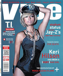
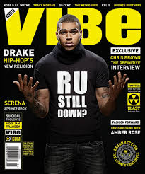
The audience for my magazine is R&B and Hip Hop lovers, as you can see from my audience profile that the type of person that would read my magazine would be the type of person who would idolise an R&B/ Hip Hop artist. My target audience is 16 - 28, this is because it is too mature for young teens but appeals more to older teenagers. The audience for my magazine would be the same sort as the audience for VIBE magazine and I got a lot of inspiration from VIBE magazine.
Evaluation Question 3
3. What kind of media institution might distribute your media product and why?
Question 3
View more presentations from samritam.
Conclusion
I have chose for this magazine institute because there is space in the market for this magazine as NME is for a different genre so it wont take the sales of it. Also NME magazine has really good photography and they are very well known for there good magazine which would mean that people would buy my magazine as it is published by a well known brand.
Evaluation Question 2
2. How does your media product represent particular social groups ?
This video shows people of the sort of age group that would read my magazine. It is sort of the same genre but it is more indie and dance than my genre but I think that it fits in well with my social groups because people of the age of my target audience act like this and wear clothing like this.
This video shows people of the sort of age group that would read my magazine. It is sort of the same genre but it is more indie and dance than my genre but I think that it fits in well with my social groups because people of the age of my target audience act like this and wear clothing like this.
Conclusion
My media product represents particular social groups because of the use of images. The images are mainly for a female target audience which is the main media group, this is because of the use of colours and images. The age group for my magazines is 16-28 and the magazine is aimed at more middle class people and also people that are interested in R&B/ Hip Hop music so they would be interested in buying my product. My inspiration was mainly taken from Vibe magazine as it is a magazine which is most like the idea of mine so I took inspiration from it. Vibe magazine is around about £4 which is about the same price as my magazine and the magazine would be in shops such as WH Smiths and Waterstones. I wanted my magazine to aim at both genders but through the colours and images I think it aims more at a female audience.
Evaluation Question 1
1. In what ways does your media product use, develop or challenge forms and conventions of real media products? (i.e. of music magazines)
Title
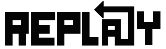
The title of the magazine: For the title of my magazine I chose a word that related to music. I chose the name Replay because I thought it worked really well for a music magazine and the magazine would want to be replayed (re-read) over and over again. I got my font of DaFont.com which was called 'A okay'. The font was really bold and stood out as other R&B magazines do, so I wanted it to link in with other Hip hop and R&B magazines. The replay logo originally looked like the image below but I added an arrow onto the A on paint. I wanted to keep the arrow idea that I had in my draft because I thought that it looked really individual and it made the magazine more memorable and would make it stand out more and the word replay reminds me of an arrow and replaying something so I thought it worked well. I added the arrow and it came to the final title. This develops real media products because it has the usual block capital letters that are genuinely used on magazines but its develops them by have a unique feature on it. This is sort of like I Love fake magazine which has a heart on the title of the image which makes it stand out a lot more that a normal boring masthead. I wanted my masthead to have a unique point to it and I think that it works. I love fake has a heart for the love and Replay has an arrow for replay, both of the symbols represent the name. This masthead challenges other magazines for example Vibe magazine, because it has a unique point to it, this could be it's Unique selling point. The arrow challenges other magazines which have really boring simple mastheads which won't catch your eye. This masthead challenges other real media products because they are all simple and bold, so having my masthead may look a little different from them and make people think it's a bit weird, but examples like I love fake show that it works with a little symbol to make it stand out.


Costumes, props, iconography used to reflect genre
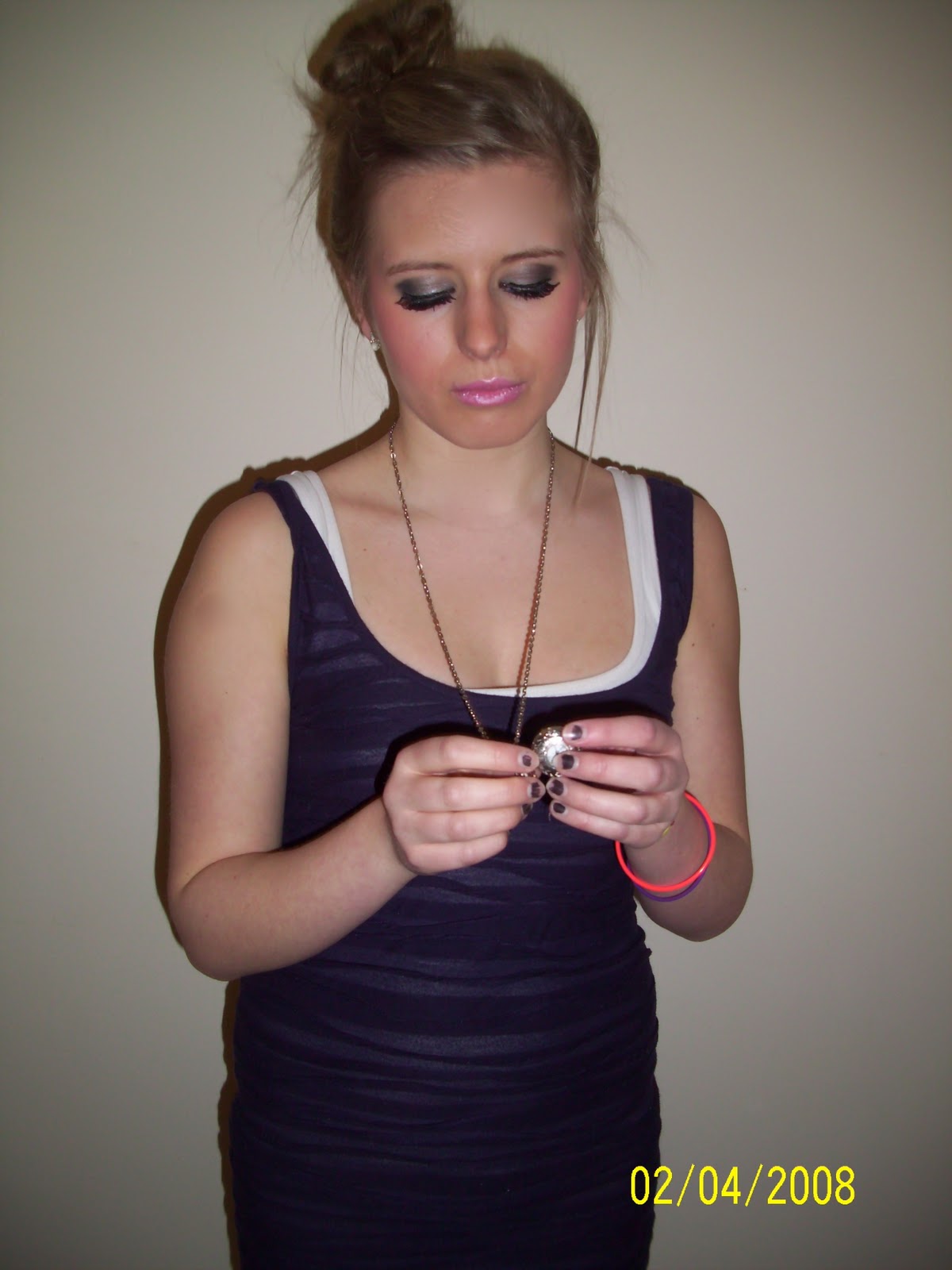
The costumes on the model were quite simple images, I wanted the dress to be simplistic as it would put more emphasis on the title and the makeup of the model. I made sure that the makeup was flawless and I wanted the makeup to be really dark around the eyes so I made sure that the eyeshadow was dark around the edges and that she was wearing fake eyelashes. I thought the jacket worked really well because it suited my genre really well and also it made my model look as if she had more attitude. The clothing was quite simple on the covers on VIBE magazine so I kept to that theme. I used the clock necklace as a prop as I wanted more to be going on in the photo so I thought the model having something near her mouth would look really good and I think it works well, it is like the VIBE magazine which has a finger over the mouth of the model and that too works really well so I thought something near the mouth of my model for the cover would look really good and draw you to look at the magazine rather than just being a picture of the model. The props of my model develops normal magazines because normal magazines don't tend to have props on them. The costume on my model isn't really abstract like the ones in Vibe magazine and this challenges normal magazines in this way because it show more the simplistic R&B than Vibe. I think that the use of the prop on the front (The watch necklace) means that people focus on it which makes people curious to read because it is an unusual pose. I was contemplating whether to use a microphone/ headphones as a prop but I looked at many magazines and noticed that none of them used these as props so I thought that it wouldn't fit in with the music magazines if I used it. The costumes in Vibe magazine seem to be quite plain when there are props involved and also seems to focus more on the model rather than the clothing which is the effect that I wanted to achieve too.
Camerawork and framing of images
The cover used a mid shot on it and I think this worked really well as most magazines have mid shots on the cover. The contents page is more of a long shot and I chose not to do a long shot as you can't really see the expressions and attitude of the model as much as the mid shots. I think that the different camera work sizes worked well in my magazine, I did a really big image for the cover of the magazine and this worked well, but it was a mid shot. I think that the contents page picture worked well and it was more of a mid long shot as it was took from quite far away but I think it worked well as it was quite a simple image and the black and white imagery made you focus more on the attitude of the model which worked better than if the image was in colour, I decided to make the image black and white because I liked the use of having a black and white image for the contents and I was mostly inspired to have a black and white image for my contents from V magazine and the Cheryl Cole edition. After I took my pictures I made sure that the skin was flawless by editing it on Iphoto and this made sure that my photo had no spots so it looked more professional. The images developed the ones on normals magazines because it consisted of the models hair being up which is quite unusual for a magazine but it is done occasionally for example on VIBE magazine. The images were placed on a grey background which made them stand out more and on the black and white images I left the background on them. The images challenge other magazines because the image is quite quirky and individual and it stands out. I made sure that my model showed attitude through the images because it meant it would look like a real magazine as all magazines make sure the images show attitude.
Title, Article, header etc, font and style
All of my fonts were downloaded of www.DaFont.com. The title of the magazine used the font which was called 'A okay' which I thought worked well as it was really bold and stood out. The rest of the fonts used were, 'Middle Woman' 'English Essay' these fonts all worked really well together as Middle Woman made things stand out and English Essay made things look more feminine, the fonts worked well together. The fonts made it easier to see what style of magazine it was as the bold fonts made it obvious that it was a R&B/ Hip Hop magazine. I think that these fonts work really well together because they have contrasts of bold, handwritten and the square writing all work well together and the bold means that this writing will stand out so it means I could highlight key points. I chose this font because it was really bold and stood out. My writing develops magazines because most magazines have standard fonts which are quite similar but mine doesn't have similar fonts as they are all quite different. My magazine challenges magazines because the writing will stand out more as they are all very different fonts whereas normal magazines have similar fonts throughout.
Genre and how the magazine cover, contents suggests it
The genre of the magazine was R&B and I chose to do an R&B magazine because I love R&B/ Hip Hop music and I can relate to the genre as I know more about it than a different genre of magazine which I may not be able to relate to. I think that the cover suggests that it is and R&B magazine by the use of the really dark eye makeup as R&B artists have really bold makeup. I think that it is obvious that it is an R&B/ Hip Hop magazine because it shows attitude through the photo of the magazine and also the title of the magazine is quite harsh and bold which most R&B/ Hip Hop magazine titles are. I think that the contents page suggests that it is an R&B magazine because it is very simplistic with one image, as most R&B/ Hip Hop magazines only have one image on them as it has a main image rather than lots of little images which other genres of magazines have, for example a Indie magazine. I think that the contents suggests that it is an R&B magazine because it uses bold writing and the stance that the model is holding is an image which shows attitude and the images on R&B magazines show a lot of attitude. My magazine challenges normal magazines because it doesn't have a recognised person on the front of the magazine which means people may not want to look at it as they don't recognise the person on the cover but it also develops the magazines because people will be intrigued and want to know more about the new artist.
How your artist is represented
The artist is represented as an R&B artist, this is shown through the images throughout my magazine. On the cover the Artist is show side/face on which a bend head. The artist is looking at the camera straight in the eye so that it captures the readers attention and this makes it much more like a magazine. The jacket worn on the contents is an R&B type of jacket and this means that the audience know what genre the magazine is. The quotes on the cover, contents and double page spread show the Artist's feeling and her personality so the reader knows the artists personality. The artist is represented as being really excited about becoming a singer and also annoyed at the haters, and it shows her attitude through the quotes and also through the article. My artist is represented on the front page which challenges other magazines which have artists which are well known and people may want to buy it because they will be intrigued by the new artist.
Colour scheme
The colour scheme of my magazine is baby pink, dark purple and black. It also involves a bit of white in it. I chose to do this colours scheme as my model was wearing pink lipstick so I wanted the colours to be the same as what my model was wearing. I used the eyedropper tool on photoshop and got the same colour as my models lips so I could get the same pink colour, I also did the same with the purple top she was wearing, this meant that all the colours linked in and this is what I had planned to do when I was planning and researching. The pink and purple colours clash, but I think that they work really well together as it makes the magazine more girly and makes all the black points stand out. The colour scheme develops magazines because most magazines used 2 colours whereas my magazine uses 3 colours. My magazine colour scheme challenge real magazines because they are quite contrasting colours which stand out whereas normal magazines use complementing colours. I think that the colours are really girly and target mainly a female audience which challenges other magazines which target both males and females.
Evaluation 1 1
Title
The title of the magazine: For the title of my magazine I chose a word that related to music. I chose the name Replay because I thought it worked really well for a music magazine and the magazine would want to be replayed (re-read) over and over again. I got my font of DaFont.com which was called 'A okay'. The font was really bold and stood out as other R&B magazines do, so I wanted it to link in with other Hip hop and R&B magazines. The replay logo originally looked like the image below but I added an arrow onto the A on paint. I wanted to keep the arrow idea that I had in my draft because I thought that it looked really individual and it made the magazine more memorable and would make it stand out more and the word replay reminds me of an arrow and replaying something so I thought it worked well. I added the arrow and it came to the final title. This develops real media products because it has the usual block capital letters that are genuinely used on magazines but its develops them by have a unique feature on it. This is sort of like I Love fake magazine which has a heart on the title of the image which makes it stand out a lot more that a normal boring masthead. I wanted my masthead to have a unique point to it and I think that it works. I love fake has a heart for the love and Replay has an arrow for replay, both of the symbols represent the name. This masthead challenges other magazines for example Vibe magazine, because it has a unique point to it, this could be it's Unique selling point. The arrow challenges other magazines which have really boring simple mastheads which won't catch your eye. This masthead challenges other real media products because they are all simple and bold, so having my masthead may look a little different from them and make people think it's a bit weird, but examples like I love fake show that it works with a little symbol to make it stand out.
Graphology/ Page layouts
The layout of the magazine was symmetrical because I wanted it to be like VIBE magazine. The picture was quite symmetrical so I thought I should have writing on both sides of the picture and on either side of it. I wanted the layout of the magazine to be simple but not too simplistic and to look neat and not cramped. I think I achieved this by making it set out neat. I made sure the pictures were all R&B style pictures. I also made sure that the contents was really neat and no too cluttered like some magazine contents are for example NME magazine which has a very cluttered contents page. I wanted to keep the contents page quite simple as most R&B contents pages are, so I wanted it to fit in with other R&B contents pages. The graphology of the magazine develops normal media magazines because in the double page spread normally there is one picture on one side and the writing on the other, I chose not to do this as I wanted mine to look more visual and stand out more. This layout worked better than on one page with my images so I stuck to the way that I did it. The cover was pretty simple with the layouts because I wanted the main focus to be the image as it would be the thing drawing people to read it. The contents page was a simple format and it was easy to understand. Every part of my magazine was really simple which made it more like a real magazine so it won't stand out. My magazine challenges other magazines for example NME which is more in your face whereas in comparison mine is more simple and less in your face so it challenges magazines like NME. Vibe magazine is my main inspiration and this meant that the magazine needed to be simple like this magazine, as this magazine is the same genre as my magazine. It develops the conventions of a real magazine because it has more than one picture on the double page spreadCostumes, props, iconography used to reflect genre
The costumes on the model were quite simple images, I wanted the dress to be simplistic as it would put more emphasis on the title and the makeup of the model. I made sure that the makeup was flawless and I wanted the makeup to be really dark around the eyes so I made sure that the eyeshadow was dark around the edges and that she was wearing fake eyelashes. I thought the jacket worked really well because it suited my genre really well and also it made my model look as if she had more attitude. The clothing was quite simple on the covers on VIBE magazine so I kept to that theme. I used the clock necklace as a prop as I wanted more to be going on in the photo so I thought the model having something near her mouth would look really good and I think it works well, it is like the VIBE magazine which has a finger over the mouth of the model and that too works really well so I thought something near the mouth of my model for the cover would look really good and draw you to look at the magazine rather than just being a picture of the model. The props of my model develops normal magazines because normal magazines don't tend to have props on them. The costume on my model isn't really abstract like the ones in Vibe magazine and this challenges normal magazines in this way because it show more the simplistic R&B than Vibe. I think that the use of the prop on the front (The watch necklace) means that people focus on it which makes people curious to read because it is an unusual pose. I was contemplating whether to use a microphone/ headphones as a prop but I looked at many magazines and noticed that none of them used these as props so I thought that it wouldn't fit in with the music magazines if I used it. The costumes in Vibe magazine seem to be quite plain when there are props involved and also seems to focus more on the model rather than the clothing which is the effect that I wanted to achieve too.
Camerawork and framing of images
The cover used a mid shot on it and I think this worked really well as most magazines have mid shots on the cover. The contents page is more of a long shot and I chose not to do a long shot as you can't really see the expressions and attitude of the model as much as the mid shots. I think that the different camera work sizes worked well in my magazine, I did a really big image for the cover of the magazine and this worked well, but it was a mid shot. I think that the contents page picture worked well and it was more of a mid long shot as it was took from quite far away but I think it worked well as it was quite a simple image and the black and white imagery made you focus more on the attitude of the model which worked better than if the image was in colour, I decided to make the image black and white because I liked the use of having a black and white image for the contents and I was mostly inspired to have a black and white image for my contents from V magazine and the Cheryl Cole edition. After I took my pictures I made sure that the skin was flawless by editing it on Iphoto and this made sure that my photo had no spots so it looked more professional. The images developed the ones on normals magazines because it consisted of the models hair being up which is quite unusual for a magazine but it is done occasionally for example on VIBE magazine. The images were placed on a grey background which made them stand out more and on the black and white images I left the background on them. The images challenge other magazines because the image is quite quirky and individual and it stands out. I made sure that my model showed attitude through the images because it meant it would look like a real magazine as all magazines make sure the images show attitude.
Title, Article, header etc, font and style
All of my fonts were downloaded of www.DaFont.com. The title of the magazine used the font which was called 'A okay' which I thought worked well as it was really bold and stood out. The rest of the fonts used were, 'Middle Woman' 'English Essay' these fonts all worked really well together as Middle Woman made things stand out and English Essay made things look more feminine, the fonts worked well together. The fonts made it easier to see what style of magazine it was as the bold fonts made it obvious that it was a R&B/ Hip Hop magazine. I think that these fonts work really well together because they have contrasts of bold, handwritten and the square writing all work well together and the bold means that this writing will stand out so it means I could highlight key points. I chose this font because it was really bold and stood out. My writing develops magazines because most magazines have standard fonts which are quite similar but mine doesn't have similar fonts as they are all quite different. My magazine challenges magazines because the writing will stand out more as they are all very different fonts whereas normal magazines have similar fonts throughout.
Genre and how the magazine cover, contents suggests it
The genre of the magazine was R&B and I chose to do an R&B magazine because I love R&B/ Hip Hop music and I can relate to the genre as I know more about it than a different genre of magazine which I may not be able to relate to. I think that the cover suggests that it is and R&B magazine by the use of the really dark eye makeup as R&B artists have really bold makeup. I think that it is obvious that it is an R&B/ Hip Hop magazine because it shows attitude through the photo of the magazine and also the title of the magazine is quite harsh and bold which most R&B/ Hip Hop magazine titles are. I think that the contents page suggests that it is an R&B magazine because it is very simplistic with one image, as most R&B/ Hip Hop magazines only have one image on them as it has a main image rather than lots of little images which other genres of magazines have, for example a Indie magazine. I think that the contents suggests that it is an R&B magazine because it uses bold writing and the stance that the model is holding is an image which shows attitude and the images on R&B magazines show a lot of attitude. My magazine challenges normal magazines because it doesn't have a recognised person on the front of the magazine which means people may not want to look at it as they don't recognise the person on the cover but it also develops the magazines because people will be intrigued and want to know more about the new artist.
How your artist is represented
The artist is represented as an R&B artist, this is shown through the images throughout my magazine. On the cover the Artist is show side/face on which a bend head. The artist is looking at the camera straight in the eye so that it captures the readers attention and this makes it much more like a magazine. The jacket worn on the contents is an R&B type of jacket and this means that the audience know what genre the magazine is. The quotes on the cover, contents and double page spread show the Artist's feeling and her personality so the reader knows the artists personality. The artist is represented as being really excited about becoming a singer and also annoyed at the haters, and it shows her attitude through the quotes and also through the article. My artist is represented on the front page which challenges other magazines which have artists which are well known and people may want to buy it because they will be intrigued by the new artist.
Colour scheme
The colour scheme of my magazine is baby pink, dark purple and black. It also involves a bit of white in it. I chose to do this colours scheme as my model was wearing pink lipstick so I wanted the colours to be the same as what my model was wearing. I used the eyedropper tool on photoshop and got the same colour as my models lips so I could get the same pink colour, I also did the same with the purple top she was wearing, this meant that all the colours linked in and this is what I had planned to do when I was planning and researching. The pink and purple colours clash, but I think that they work really well together as it makes the magazine more girly and makes all the black points stand out. The colour scheme develops magazines because most magazines used 2 colours whereas my magazine uses 3 colours. My magazine colour scheme challenge real magazines because they are quite contrasting colours which stand out whereas normal magazines use complementing colours. I think that the colours are really girly and target mainly a female audience which challenges other magazines which target both males and females.
Friday 11 March 2011


Thursday 10 March 2011

Wednesday 9 March 2011


Wednesday 2 March 2011
Draft Evaluation
Teachers Comments
Name: Samrita
Title: Replay
Cover: Idea is good. Layout is taking shape. Title should be in block capitals rather than the effect you have added. Images needed improving. They are quite flat. Also image is fuzzy. The whole tone of your mag is v. serious
Contents: Very sparse. Needs a more effective layout. Look at examples from last yr. and exam board for help. Image is flat - needs to be more prominent. I like the R logo.
Double Page spread: Nice layout. Head is cut off on image. Page Numbers are massive throughout - why? Interview is too short. Columns needs adjusting - too near the middle of page.
Research and Planning level: 4
Practical Draft Level: 2
From my drafts I have realised that I will need to finally take my final shots. For this I really want to use a girl because I don't think that the having a boy on the cover will draw as much attention. I will stick to the white and black colour scheme but I may change the red to another colour e.g. pink, blue etc. My cover looks rather fake and doesn't look like a magazine. I will need to make it more simplistic and have a bigger image on the front which lifts off the page more. I will edit the pictures so my model looks flawless so it makes the model look more professional. My contents page looks quite tacky and nom professional at all. I think that the I will need to redo this completely as it looks really bad and unprofessional. I will need to look at Vibe magazine and get inspiration from it. My double page spread has a good layout but it needs more writing, also I think it looks rather fake and the red doesn't look too good, I will definitely need to change the red colour as it doesn't suit my magazine. I will keep the idea of having an image on one side of the page because I think it looks really simple and effective and it looks really neat. I will have a big title at the top of the article, but I need to re-write my article because it is a little serious and people won't find it interesting and also if i'm using a girl I will need a new story.
Tuesday 1 March 2011

Monday 28 February 2011


Subscribe to:
Posts (Atom)